
DineOnCampus UI Redesign
In December 2021, I took Google’s Coursera course, Foundations of User Experience (UX) Design, in order to learn more about the field and design process. For the course’s project, I decided to learn how to use Figma to create my first non-interactive prototype. I chose to redesign Northwestern’s DineOnCampus app, used by all students to see the menus at different dining locations each day. Its current user interface requires many clicks or unnecessary scrolling in order to find information.
Role: Personal Project
Date: December 2021 — January 2022
Objective: Address the pain points I experienced with the DineOnCampus app, providing the user with more information while simplifying the user interface.
Skills: Figma, Marvel, UI/UX Design, Wireframing, Prototyping, Heuristic Evaluation
The Problem: How can I redesign the DineOnCampus app to provide information students really want regarding campus dining options, in a visually appealing way?
Here’s what the current app looks like:

Start page

Menu
Dining location details

Select meal period

Filter menu items
Nutrition information
Research: Heuristic Evaluation
Visibility of system status:
On menu pages, it is not clear whether dietary restriction filters have been successfully applied.
The system appears to recognize a user’s current location, as it tells you how far you are from each dining location, and the time, as there is an indicator for whether a cafeteria is open or closed. However, this information isn’t used to sort dining locations in a way that is useful.
Match between system and real world
Currently, the order of dining locations has no logic or mapping. They are not based on whether locations are open, nearby, nor even in alphabetical order. This makes it difficult for users to find their desired dining hall.
Clicking on a dining location defaults to its earliest menu that day, rather than the menu that is currently being served.
User control and freedom
The number of dropdown menus and subpages means that when a user misclicks, it takes many additional steps to navigate to their desired page.
Recognition rather than recall
The interface is entirely text-based; there are no visual aids to distinguish between dining halls, which would be challenging for new students or visitors unfamiliar with the names of dining halls.
Flexibility and efficiency of use
There are currently no ways to create shortcuts — for example, by favoriting a frequented dining hall — requiring users to navigate through the same clunky interface every time.
Some information, such as a student’s current dining dollar balance, are only accessible by downloading additional apps.
Help and documentation
There is no information about how to navigate the app available, leading some symbols to be indecipherable.
Phase 1: Initial Redesign / Hi-Fidelity Wireframe

An overview of all of the screens I created using Figma. The icons used in this design can be attributed to Flaticon.com’s alkhalifi design, Icongeek26, Ilham Fitrotul Hayat, and Freepik.

App Homescreen
Currently, when you open the DineOnCampus app, users have to scroll through 25 dining locations listed in cards, in no particular order.
In order to make it easier for users to find their dining location of interest, I changed the start screen to a tile design that would reduce scrolling, allowing users to see more locations at once.
The locations would also be sorted according to whether or not they were currently open, whether or not the user had favorited the location, followed by distance from current location (closest to furthest).
I also included more Northwestern branding throughout the app by more heavily utilizing the school’s purple color scheme, such as in the main header and bottom navigation bar.
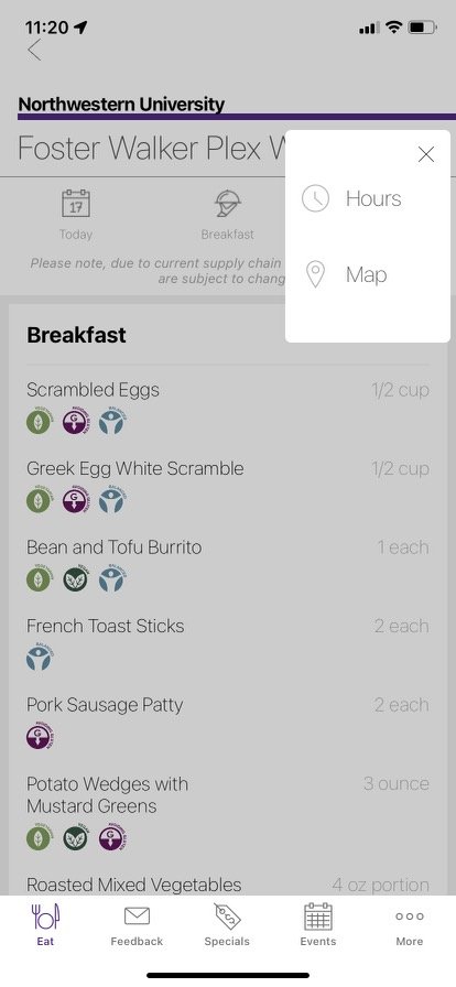
Dining Location + Menus
My goal was to simplify the page and make all affordances clearly visible and accessible. I reduced the number of hidden menus, and added some additional functionalities for users.
In my design, the operating hours are always visible.
There is a map icon to access directions to the dining location, and a star icon to add the location to the user’s favorites.
Menus have been collapsed into an always-visible navigation bar. The app will automatically navigate to the menu being served at the time accessed.
Dietary restrictions are visible at all times. Rather than using a dropdown text menu, I used the same icons used to represent each restriction throughout the rest of the app for consistency.
Users can jump to a specific section of the menu via a dropdown menu. If I only wanted to see “Desserts,” I could easily navigate to that section.
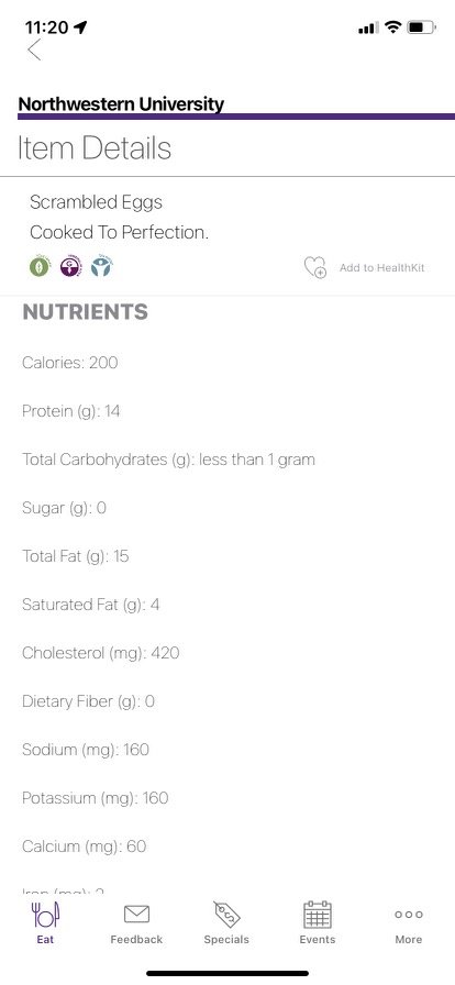
In addition to serving size, I include calorie information in the main menu. When the user clicks on a menu item, rather than navigating to a separate page, a pop-up box will appear with the dish’s full nutritional information.


Account
Currently, the DineOnCampus app has no functionality for users to see information about their meal plans.
I added a section in the main navigation bar for users to view their current meal plan, dining dollar balance, and remaining weekly meal exchanges, as well as their transaction history. This page also gives enables users to top up their dining dollar balance if they are running low.
With the addition of this feature, students could access all of their dining information in one app.
Additional Screens
I moved “Map” to the primary navigation bar in lieu of a “Feedback” page that is rarely, if ever, used. I included the option to find a location via dropdown so that users do not have to click on every pin to find a dining location.
Phase 2: Interactive Prototype

After learning more about Figma, I wanted to improve my initial wireframe and design something that looked more like a real app with more complex components.
For a project in my Technology & Human Interaction class, I created a higher-fidelity version of my DineOnCampus wireframe based on a free Mobile UI design system by Toni Gemayael. I used Marvel to create an interactive prototype.
What’s new?
Utilized Northwestern’s official brand colors and approximated fonts to convey a clearer sense of brand identity.
Increased font sizes for improved visibility.
Updated ‘Eat’ section to allow for photos of the different dining locations, moving away from a text-only interface for a more visually-appealing user experience.
Updated ‘Events’ to show a monthly calendar with dates highlighted to indicate when there are events.
Updated ‘Account’ dining dollar balance visualization to quickly show a user what proportion of their dining dollars and meal exchanges have been used up for the given period.