Form & Function Marketing
As VP of Communications for Form & Function Marketing, Northwestern’s premier student-run marketing agency, I initiated a full rebrand including a new logo, color palette, typography, website, and merchandise designs. The rebrand was received extremely positively, with applicants in the next recruitment cycle citing the new website as a factor that led to their interest in joining F&F.
Role: VP of Communications
Date: May 2021 — January 2022
Objective: Modernize and elevate Form & Function’s brand while remaining true to our organization’s warm, lighthearted culture and Northwestern identity. We needed to do a better job of articulating what F&F does for prospective members and clients in order to improve our publicity within the Northwestern student body.
Skills: Squarespace, Canva, GIMP, Web Design, HTML/CSS, Competitive Analysis
Starting Point: F&F’s brand internally and externally lacked consistency and polish compared to similar student organizations at other universities.
Logo
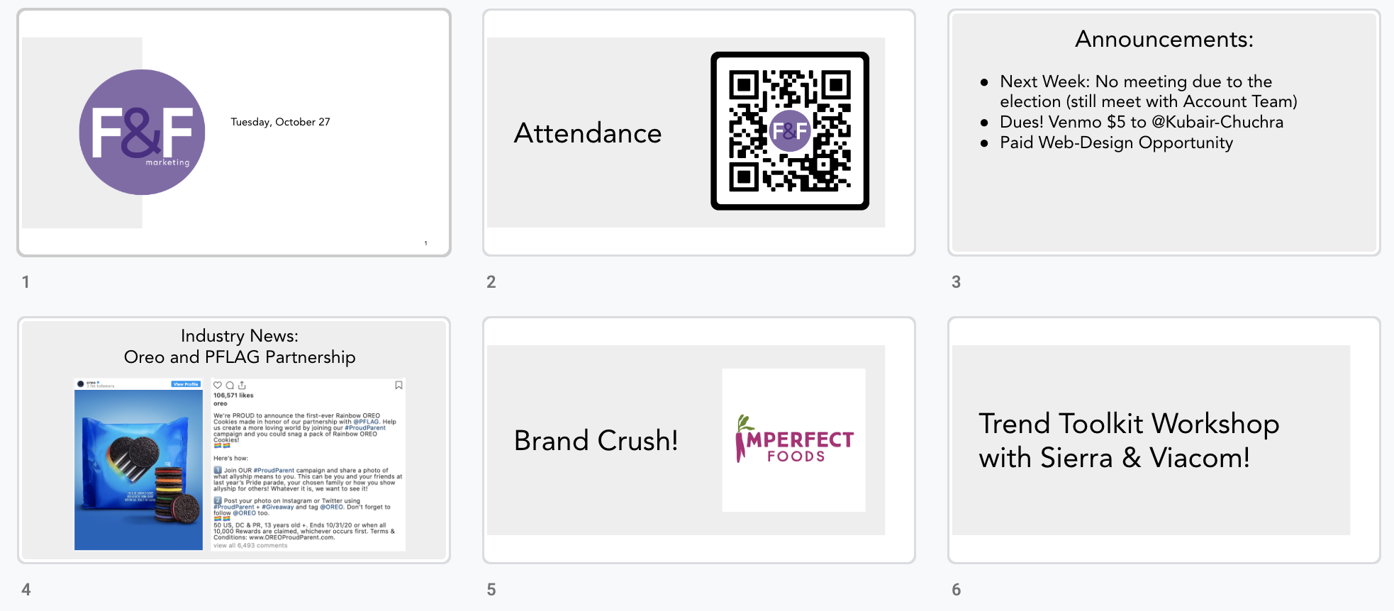
Internal Slide Decks
Website homepage
‘Our Grind’: client services
Sample case study: Block Museum
Research & Discovery:
What is F&F’s current brand?
I created a rebrand research deck including suggestions for short-term improvements to F&F’s brand and analyses of comparable student organizations at peer universities. Beyond recommendations for how we could elevate our visual identity, I also included ideas for potential collaborations and events that F&F could host in order to strengthen our brand as Northwestern’s premier marketing agency.
The Logo Redesign
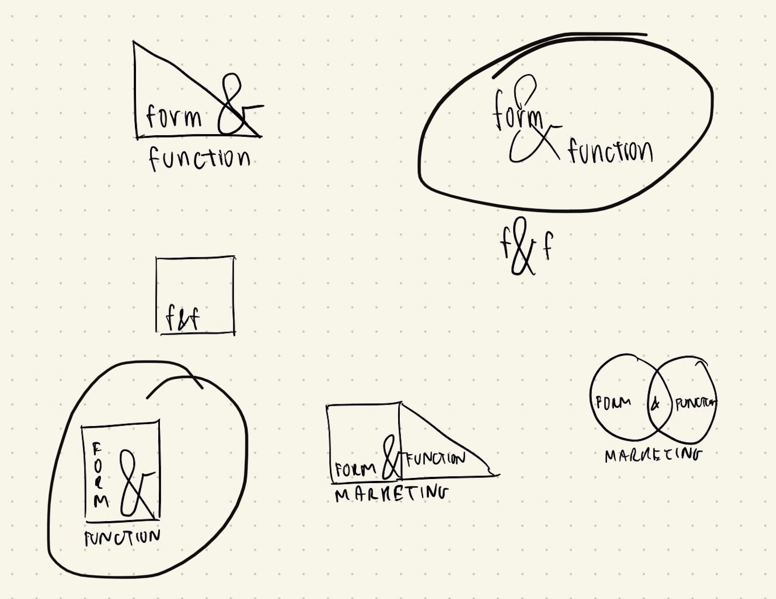
Initial sketches, focused on geometric designs that could represent ‘form’. Our Communications Committee members also noted that they appreciated the prominence of the ampersand (&), which captured our multitalented teams and aligned with Northwestern’s “AND is in our DNA” branding.
I brought some of the initial sketches to life digitally, and presented the above logo brainstorm in an executive board meeting. Members generally preferred the existing purple color scheme, so that the brand would remain recognizable to Chicagoland clients.
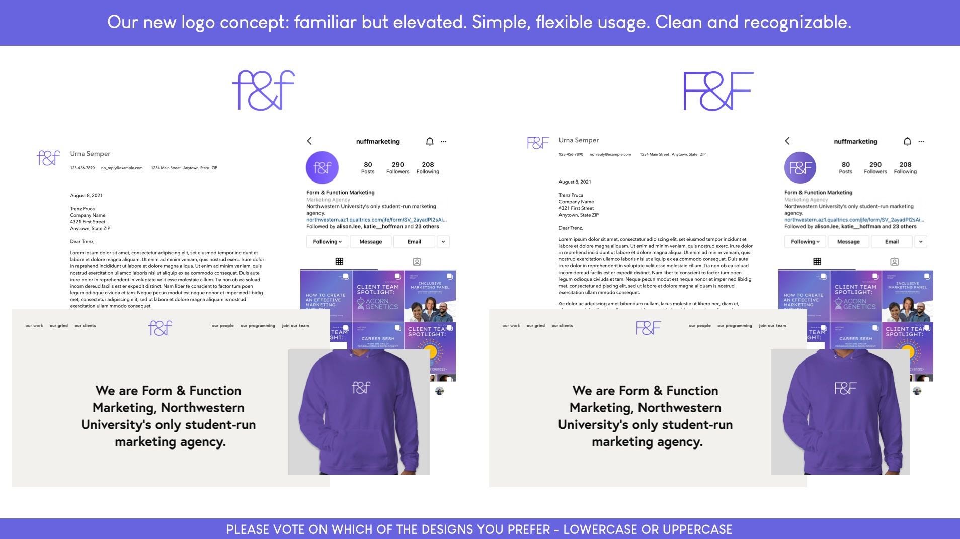
After a feedback session with F&F’s executive board and a follow-up survey allowing board members to rate different designs and provide detailed feedback, I designed a new iteration of the logo that felt more like a ‘grown up’ version of our original logo — using cleaner lines, a more modernized typeface, and placing more emphasis on our ampersand.
Original Logo
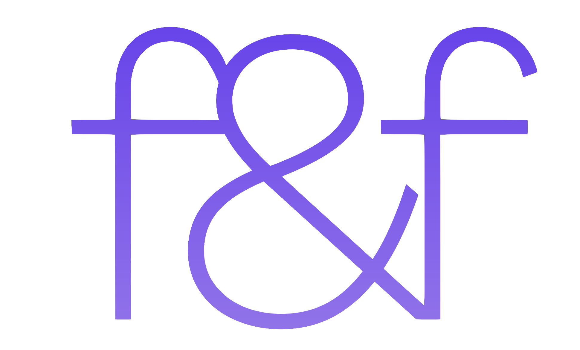
New Logo
Social Media
Before
F&F’s Instagram didn’t contain any consistent visual elements. It was difficult to see the topic of each post, and our feed appeared cluttered.
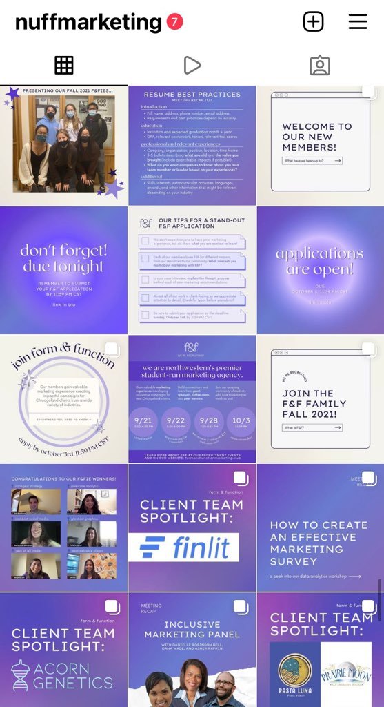
After
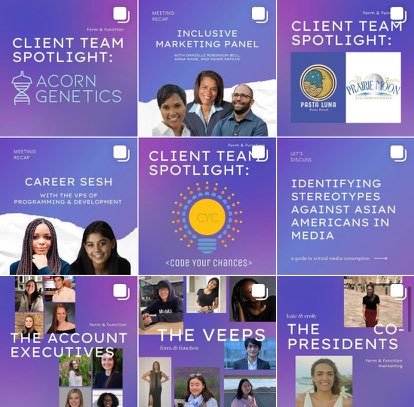
I created and lead the Communications Committee to develop a new Instagram feed, ensuring a consistent brand feel across our social media platforms and website.
Typography
Prior to our rebrand, we did not have an intentional, consistent font palette across our digital presences. The combination of serif and sans serif fonts selected allows for a wide variety of sleek yet dynamic arrangements.
Colors
The final color palette retained our key purple colors, tying F&F’s brand identity to Northwestern and the Evanston community. Rather than sticking to our original gray tones, I included a warmer neutral palette.
The Website
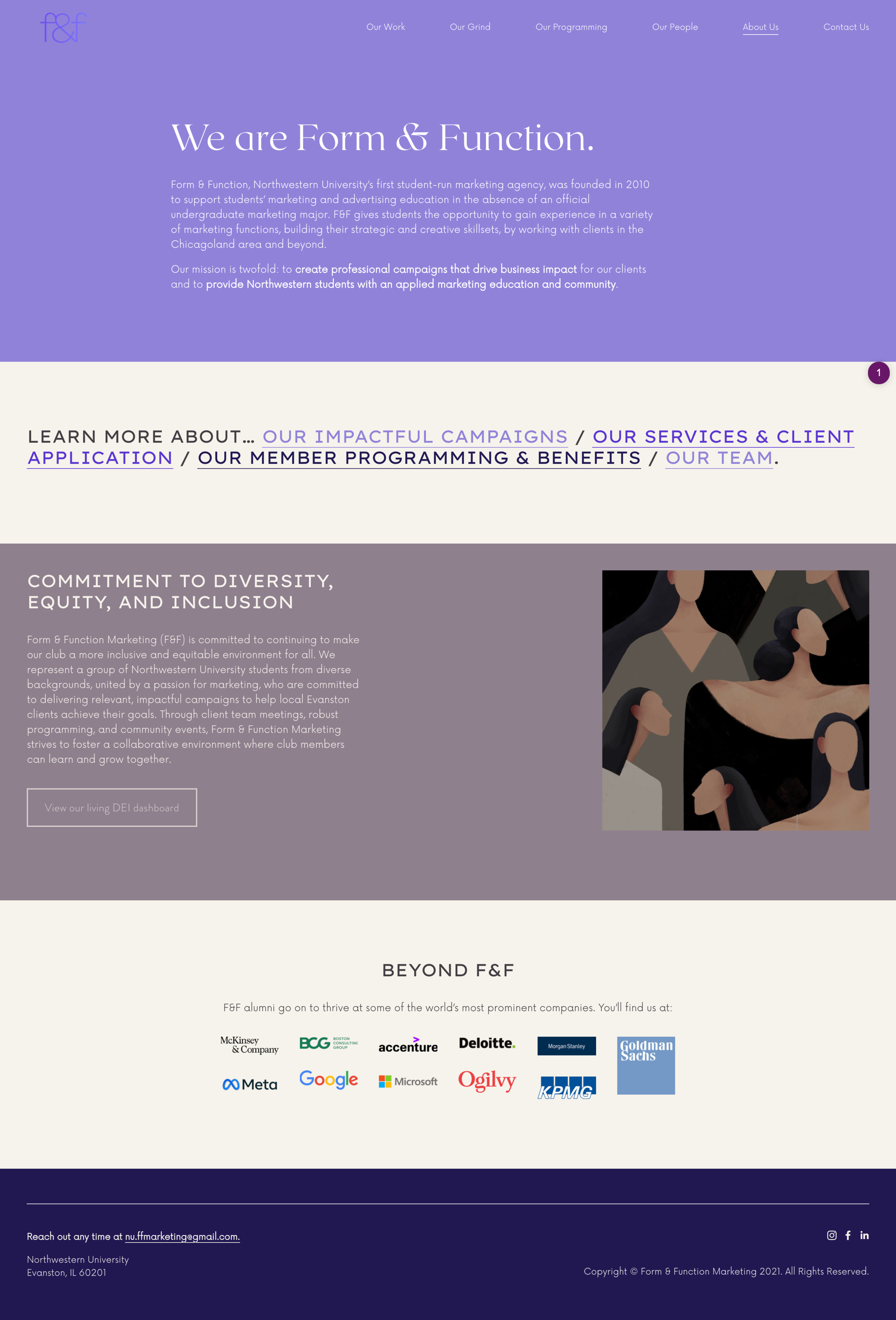
Our website underwent the most significant rebrand, including a complete reorganization of the pages, brand new case studies, and the implementation of our brand new color scheme and font palette.
My goal was to update and streamline the site’s content. All of the information prospective clients need to know regarding our services and timeline were moved to one page, while the page on our club programming included much more information about the benefits of joining F&F. I added a new ‘About Us’ page, featuring a clear mission statement and our commitments to diversity, equity, and inclusion. Each page includes more links to other pages in the site to make navigating to the user’s desired content much easier.
Internal Branding
The new templates used for our internal meeting slides reflect our new brand colors and a sleeker, more customized design.
Merchandise
To celebrate the new rebrand and our Fall 2021 newly-recruited cohort, I also designed merchandise for the club.


